
As more investors, companies, and funds start to treat bitcoin as an asset class, a set of on-chain and macro indicators has been created to help interpret its behavior and trends.
Uniquely developed Bitcoin indicators provide insight into the Bitcoin’s network health, valuation extremes, and long-term trends. In this guide, we’ll explore five of these indicators, how they work, and what they can tell you about the leading cryptocurrency.
At a Glance
- BTCCPI (Bitcoin Consumer Price Index) measures bitcoin’s real-world purchasing power based on a basket of goods.
- The Hash Ribbons and Puell Multiple track miner behavior that affects prices and adoption.
- The MVRV Ratio (Market Value to Realized Value) identifies overbought or oversold conditions.
- The Power Law and Rainbow Chart provide big-picture context for Bitcoin’s long-term growth and market sentiment.
Bitcoin Consumer Price Index (BTCCPI)
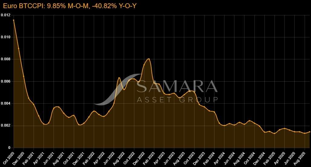
The Bitcoin Consumer Price Index (BTCCPI) measures the purchasing power of bitcoin in real-world terms. It tracks the cost of a fixed basket of goods and services in bitcoin rather than fiat currency. The result is a data-driven view of how much bitcoin it takes to live, spend, and consume over time. It is similar to the U.S. and European CPIs.
Why It Matters
- It uses bitcoin as a store of value and uses it to track its purchasing power.
- It helps investors assess bitcoin’s real-world utility and strength as a hedge against monetary inflation.
- It provides a macro lens for institutions and treasuries evaluating bitcoin for long-term reserves.
How It’s Calculated
The BTCCPI uses official CPI baskets from the U.S. and the EU, priced in USD and EUR. These costs are then converted into bitcoin using the BTC/USD and BTC/EUR exchange rates. In effect, the formula divides the cost of the CPI basket by the bitcoin price to show how many satoshis are needed to buy everyday goods.
When fewer satoshis are required to purchase the same basket, bitcoin’s purchasing power has increased. Over the past decade, the BTCCPI shows a clear trend that, despite short-term volatility, bitcoin’s real-world purchasing power has grown considerably.
Insights & Limitations
The BTCCPI is a pioneering way to measure bitcoin’s long-term value. It helps investors understand how well bitcoin preserves wealth through cycles. It is important to point out that the index does inherit limitations from traditional CPI.
For example, its fixed basket doesn’t adapt quickly to consumer behavior, and its short-term readings can fluctuate with bitcoin’s volatility. It can best be used as a macro trend indicator rather than a short-term trading signal.
Hash Ribbons
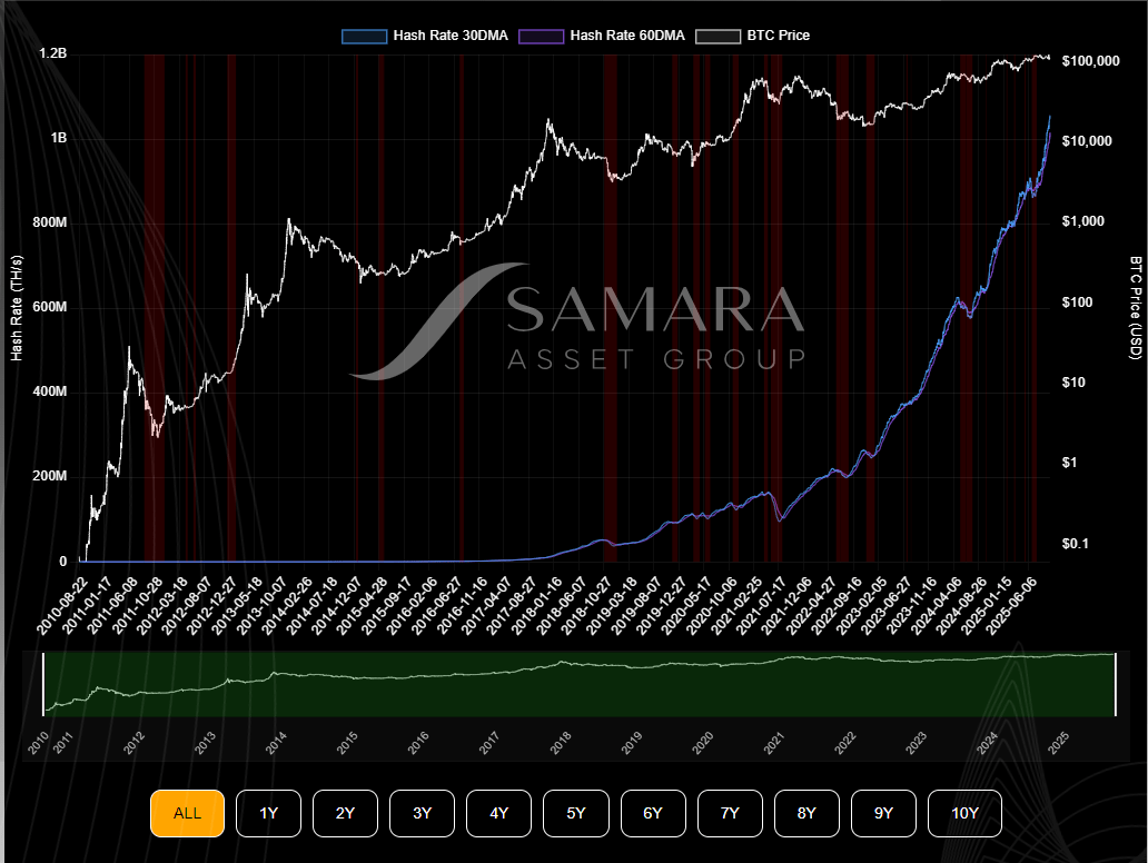
The Hash Ribbons indicator focuses on Bitcoin’s mining network. It was developed from an observation that miner behavior often precedes price reversals. It uses hash-rate data to identify periods of miner stress and recovery.
Why It Matters
- Mining is Bitcoin’s security backbone, and tracking it reveals when the network is under stress.
- Miner capitulation happens when miners shut down operations due to unprofitability, and this has historically aligned with market bottoms.
- Recovery signals, where the short-term hash rate rebounds, often coincide with renewed bullish momentum.
How It’s Calculated
The indicator compares two moving averages of Bitcoin’s hash rate: a 30-day and a 60-day simple moving average. When the 30-day average drops below the 60-day average, miners are under pressure. When it crosses back above, it suggests network recovery and often marks the end of miner capitulation.
Insights & Limitations
Hash Ribbons offer a window into bitcoin’s supply side. Miner capitulation often coincides with the later stages of a downturn, when weaker miners have already sold or shut down. Once capitulation ends and hash rate recovers, historical data often show price starting to recover as well. However, it’s a lagging indicator, as by the time the signal appears, much of the decline may have already occurred. It’s most effective when used to confirm other long-term valuation signals rather than for timing shorter-term trades.
Puell Multiple
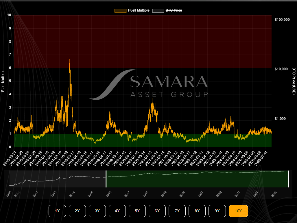
The Puell Multiple, created by analyst David Puell, measures miners’ daily revenue against its historical average. It’s one of the most established on-chain tools for understanding Bitcoin’s market cycles based on the profits miners make.
Why It Matters
- It highlights when miner revenue is exceptionally high or low, therefore revealing market extremes.
- It helps gauge selling pressure from miners. Low revenues reduce sales pressure, while high revenues can trigger it.
- It has a strong historical record of marking major cycle peaks and troughs.
How It’s Calculated
According to this guide on the Puell Multiple, the metric divides the current daily issuance value (the USD value of new BTC mined per day) by its 365-day moving average. When the ratio falls below 0.5, miners earn unusually little, often during market bottoms. When it rises above 4.0, miners earn far more than average, a pattern frequently observed at market tops.
Insights & Limitations
The Puell Multiple captures miner behavior and is arguably one of bitcoin’s most influential fundamental forces. It reveals where bitcoin sits within the broader market cycle, from despair to high excitement. However, it doesn’t provide exact timing for entries or exits, and its threshold bands shift after halving events as block rewards change. Like most on-chain metrics, it’s best used to contextualize, not predict.
Bitcoin Power Law (Price Trend Model)
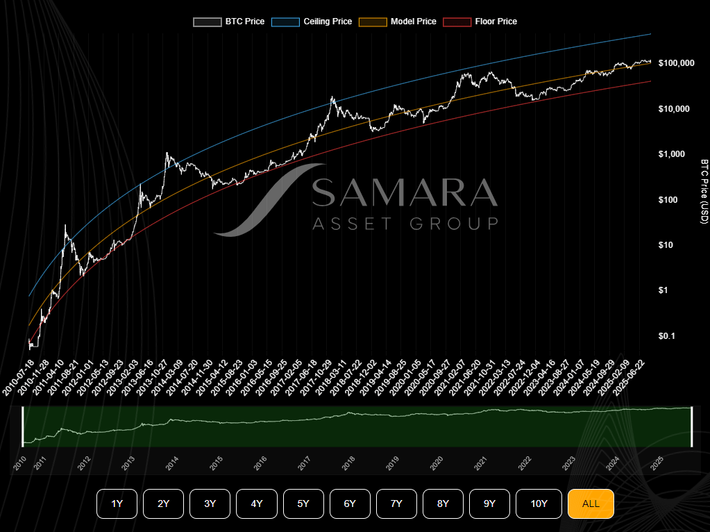
The Bitcoin Power Law model takes a long-term view of bitcoin’s growth. Based on the observation that many natural and social phenomena follow power-law relationships, this model fits bitcoin’s historical price to a power function that predicts how its value could scale with time.
Why It Matters
- It shows bitcoin’s price trajectory as a structural, long-term phenomenon rather than random volatility.
- It supports the digital gold narrative by modeling adoption and price within a consistent growth curve.
- It provides macro context for investors, helping to visualize overvaluation or undervaluation in decades-long terms.
How It’s Calculated
The model plots Bitcoin’s historical price on a log-log chart and fits a line that represents a power-law relationship. In Samara’s implementation, the exponent value is around 5.8. The formula can be simplified as:
Price = A × (days since genesis block)ⁿ
where ‘A’ is a constant and ‘n’ is the power exponent.
When Bitcoin’s price deviates far below the curve, the model suggests undervaluation, and when it soars above, it hints at overvaluation. Some versions of the model suggest that six-figure valuations are plausible within the next decade, but these are illustrative scenarios, not guarantees..
Insights & Limitations
The Power Law model provides a big picture that helps investors and companies understand bitcoin’s journey within a predictable adoption curve. However, it’s based entirely on historical data and assumptions that may not hold forever. Regulatory shifts, technological advances, or macro shocks can cause deviations.
Bitcoin Rainbow Chart
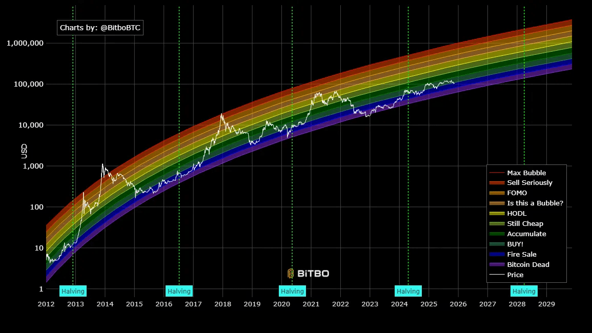
Courtesy of Charts Bitbo.
The Bitcoin Rainbow Chart is a mostly visual tool for interpreting the market, and its origins are a Reddit meme. It overlays bitcoin’s historical price on a logarithmic chart divided into color bands, from deep blue ‘fire sale’ zones to bright red ‘bubble’ territory.
Why It Matters
- It provides an intuitive visual representation of long-term market sentiment.
- It’s a communication tool and easy to share and digest.
- It helps investors anchor expectations, showing how far bitcoin’s price is from historical extremes.
How It’s Calculated
The chart is built on a log-scale regression line of bitcoin’s historical price, with additional colored bands added above and below the trend line. Each color corresponds to a sentiment level. Blue means undervalued, yellow means fairly priced, and red indicates bubble territory. There’s no industry standard formula behind the bands. The chart is a heuristic visualization of historical valuation zones rather than a precise analytical model.
Insights & Limitations
Despite its meme origins, the Rainbow Chart captures a psychological truth about bitcoin cycles. The higher it climbs on the chart, the greater the risk of euphoria and correction. However, it shouldn’t be mistaken for a scientific indicator. The band placements are arbitrary, and as Bitcoin’s adoption curve evolves, the model will require adjustments. Its value lies in storytelling and education more than data precision.
Market Value to Realized Value (MVRV) Ratio
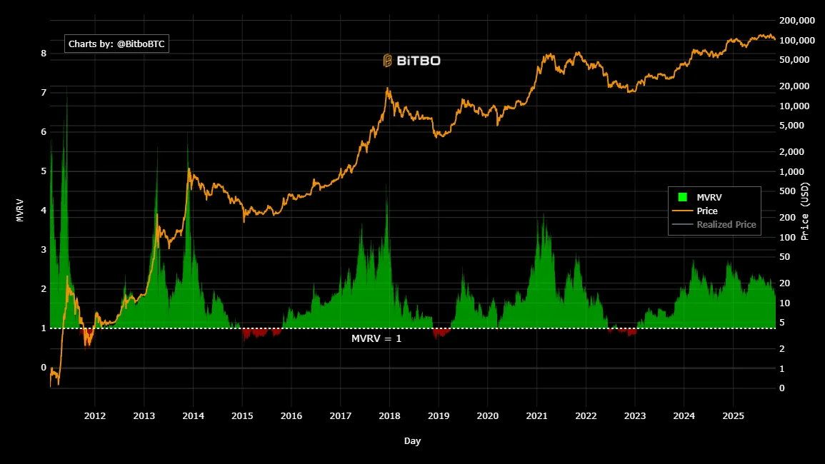
Courtesy of Charts Bitbo.
The Market Value to Realized Value (MVRV) Ratio measures how far bitcoin’s current market capitalization deviates from the average cost basis of all coins on the network. It’s one of the most widely used on-chain valuation metrics for identifying overbought and oversold conditions.
Why It Matters
- It shows whether investors are, on average, in profit or at a loss.
- It helps spot valuation extremes that historically align with tops and bottoms.
- It’s a reliable benchmark among on-chain analysts and institutions.
How It’s Calculated
The formula is simple:
MVRV = Market Value / Realized Value
The market value is the total supply multiplied by bitcoin’s current price. The realized value measures the total value of all coins based on the price they last moved on-chain, representing the collective cost basis of holders.
An MVRV ratio above 3.5 has often marked cycle tops, while readings below 1.0 indicate that most investors are underwater, which are conditions often associated with accumulation phases.
Insights & Limitations
MVRV provides a clear snapshot of market profitability and sentiment. When investors hold large unrealized profits, the risk of distribution rises. Conversely, widespread losses tend to come before recoveries as weak hands capitulate. However, it isn’t very accurate in timing, and dormant or lost coins can skew results. Like other indicators, it’s most reliable when used alongside others that track network strength or macro cycles.
Which of These Indicators Is the Best for Your Strategy?
Each of these indicators serves a unique purpose. The BTCCPI and Rainbow Chart are perfect for storytelling and illustrating bitcoin’s long-term value to a broad audience. The Puell Multiple, Hash Ribbons, and MVRV Ratio are more detailed and offer actionable insights into miner behavior and market valuation.
Meanwhile, the Power Law model provides the big picture, helping institutional investors and analysts understand where bitcoin sits within its growth trajectory.